Mapping
The GIS Team can make a wide variety of maps to display your data appropriately. We can export static maps as PDFs or as image files to be used in reports, presentations, posters, or websites. We also can run spatial analyses or create interactive web applications to display your data.

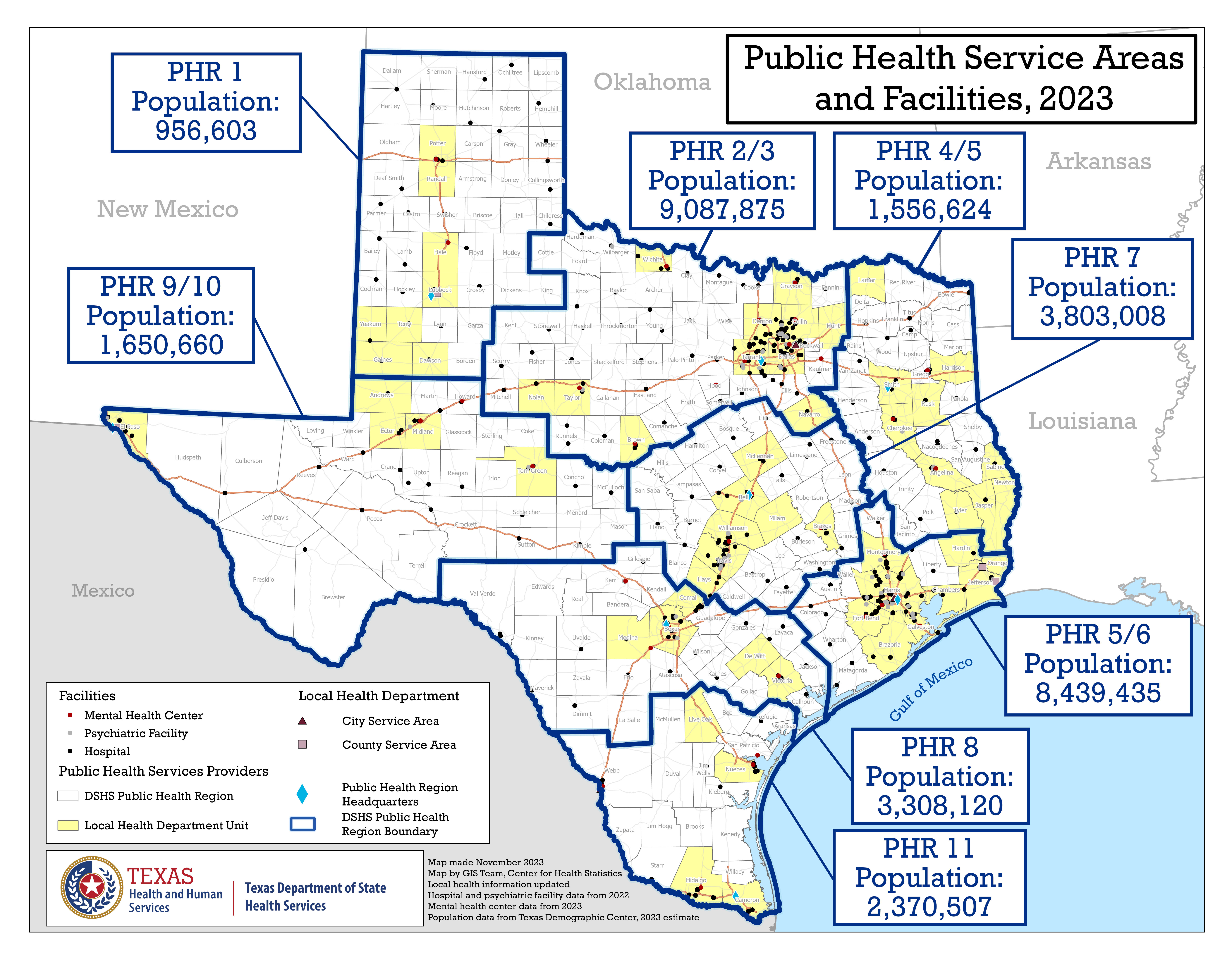
Example above: Reference map of public health service areas and facilities, along with information on population by region.
We can create reference maps showing:
- Point locations (for example: hospitals and federally qualified health centers)
- Line features (for example: major roads)
- Polygon features (for example: counties, public health regions, and municipality boundaries)
- Raster data (for example: gridded surfaces of temperature or land cover)
We maintain spatial datasets for many of the most commonly used features and political boundaries. We also can create new spatial data through geocoding or obtain reliable spatial data from reputable sources as needed.

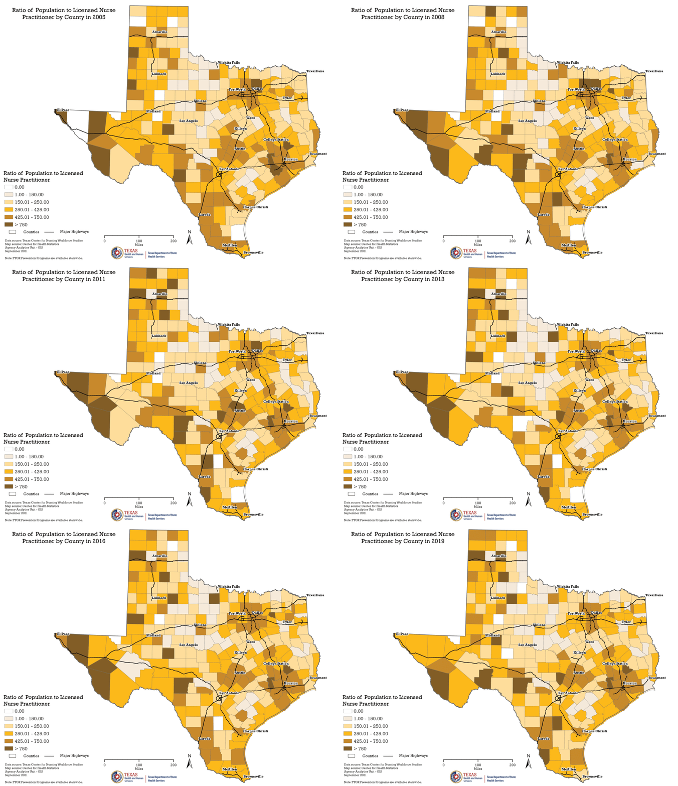
Example above: Animated time series of choropleth maps showing the ratio of population to licensed nurse practitioner per county from 2005 to 2019. Counties that are colored white did not have a licensed nurse practitioner that year.
We also can create quantitative thematic maps. These are maps that transform your datasheets into a spatial representation of that information.
The most common type of quantitative thematic map that we can create is the choropleth map. This is a map where polygon features are colored according to their associated values. If you have a dataset of point locations, we can aggregate by polygon (for example: primary care physicians per 10,000 people by county). We can work with you to select the best data classification method and color scheme for your data.

Example above: Summary of the categories of substance abuse block grant projects funded per region.
We also can make a proportional symbol map to represent your data. This type of map is created by sizing features according to their associated values. We can incorporate graphs, such as pie charts or bar graphs, to represent different categories in your dataset.
In addition to these commonly requested quantitative thematic maps, we can work with you to create other customized maps, such as dot density maps or flow maps.